The challenge: Nation's oldest Jewish book fair in need or distinct, current branding to attract younger demographic.
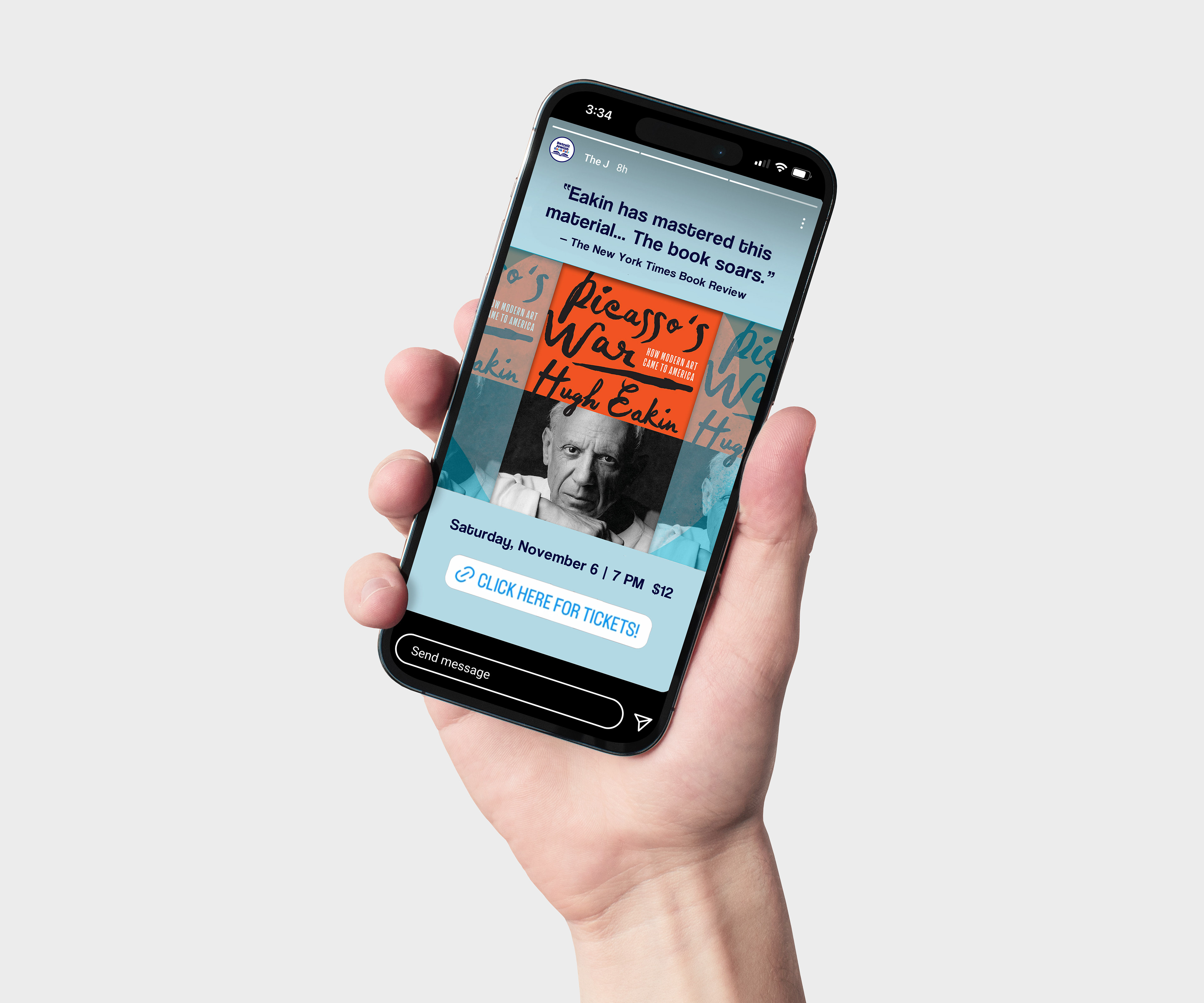
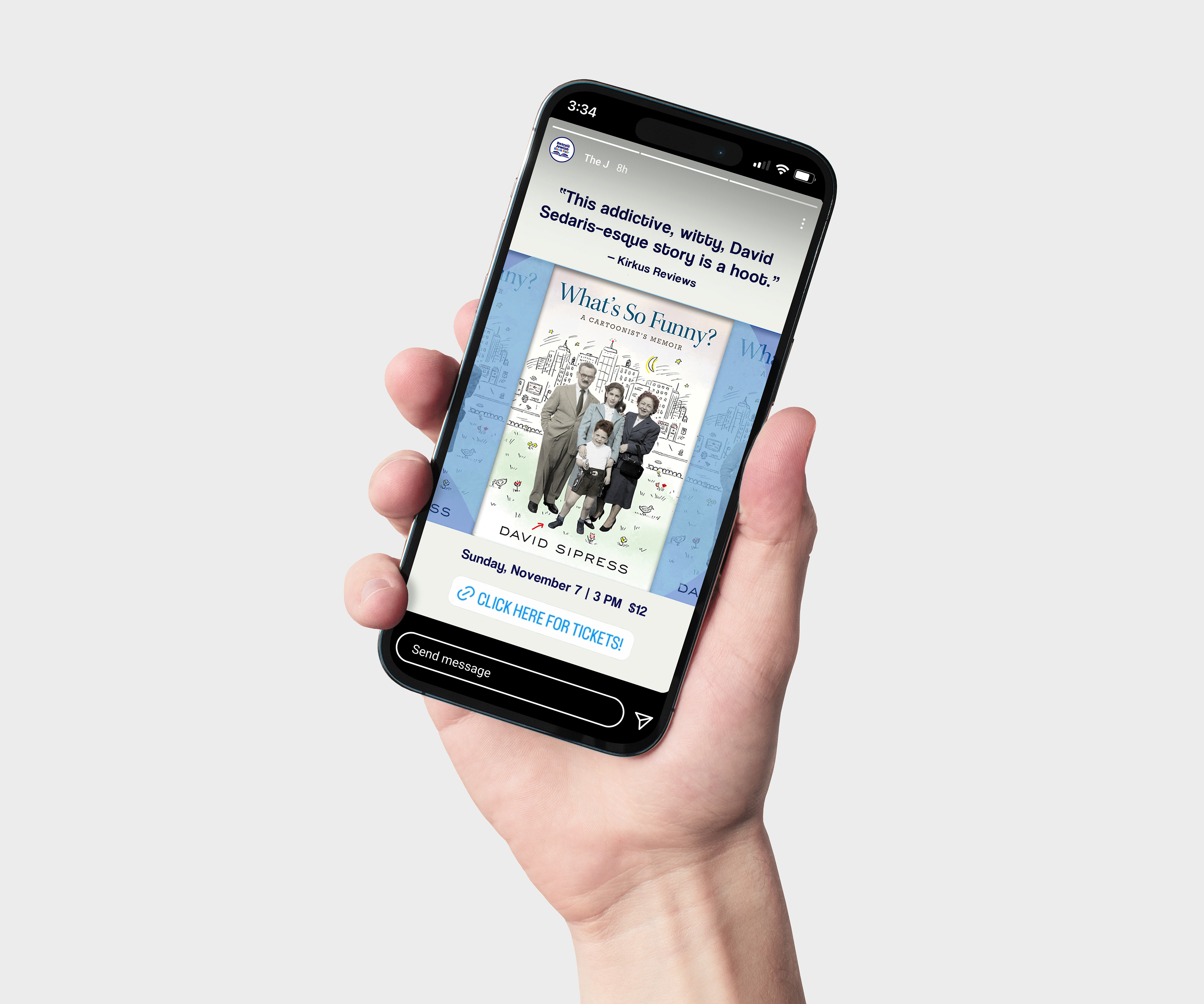
The solution: Metro Detroit invites you to celebrate the art of Jewish storytelling with a book fair spanning 10-14 days each year in November. The book, bird, and leaves honor the ancient art of Jewish papercutting. The bold typeface and colors paired with organic illustrations breathe new life into the brand.
The brand deliverables: Logo, font kit, color palette, illustrations (created in procreate), copywriting
The marketing deliverables: Annual brochure, postcard, social media graphics, eblasts, image cards.
I went through many logo revisions to find the perfect version for this brand.
Campaign work: 2020-2022
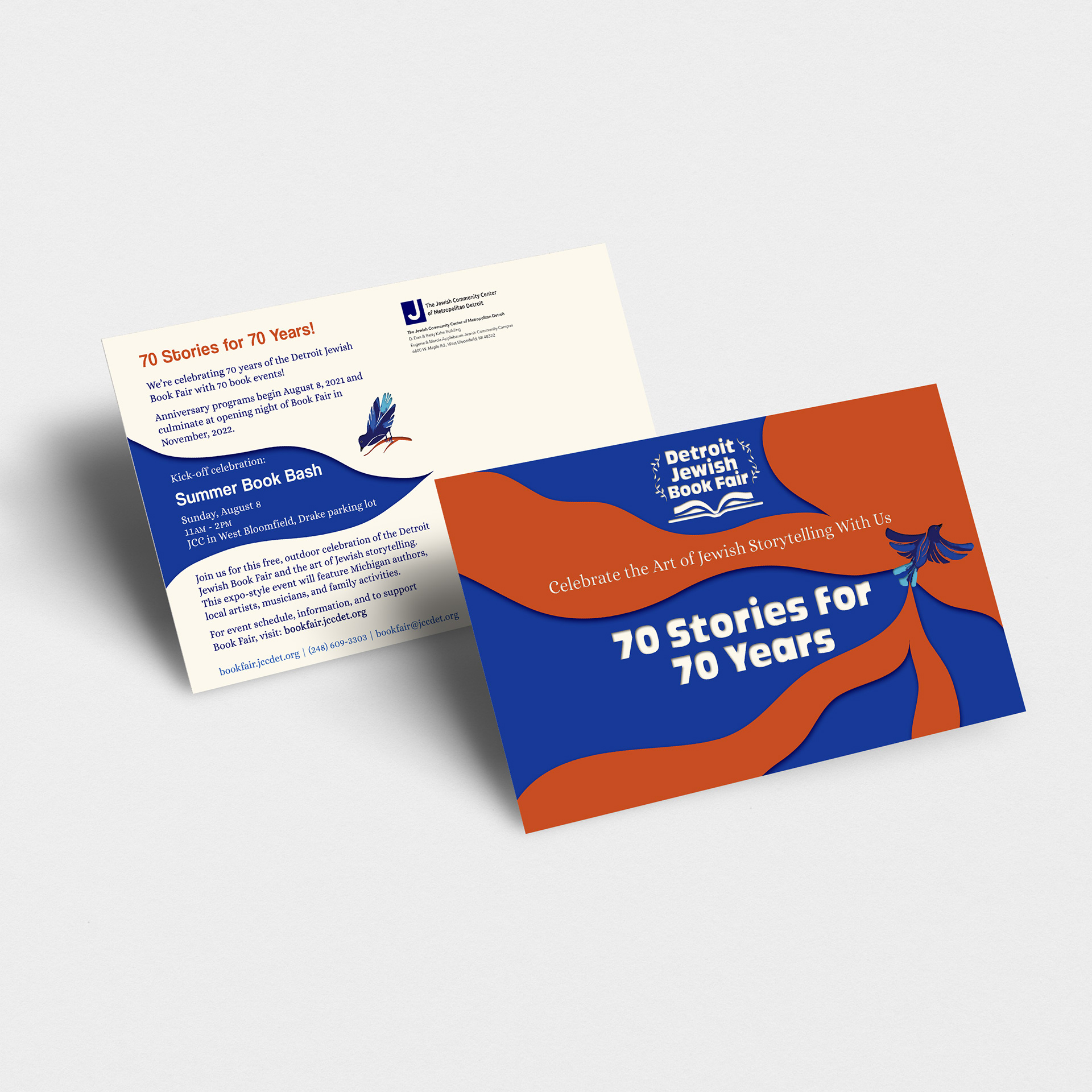
2021 postcard design, mailed to households throughout metro Detroit.
This enamel pin was so fun to make! Cheeky text pairs well with book fair branding to create a truly memorable and fun enamel pin to hand out at the 2021 Detroit Comic Con. We wanted to create a unique swag item that people would want to put on display. Book Fair logo was printed on the back.
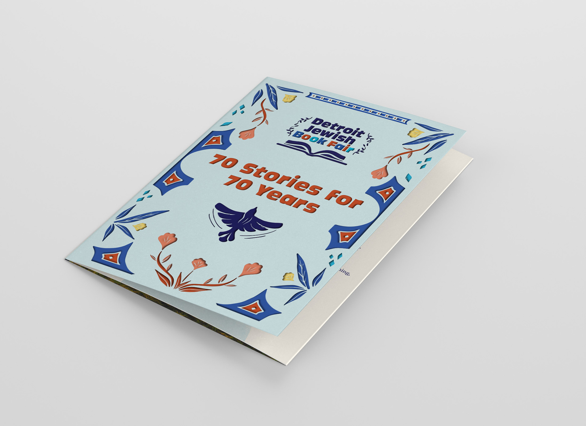
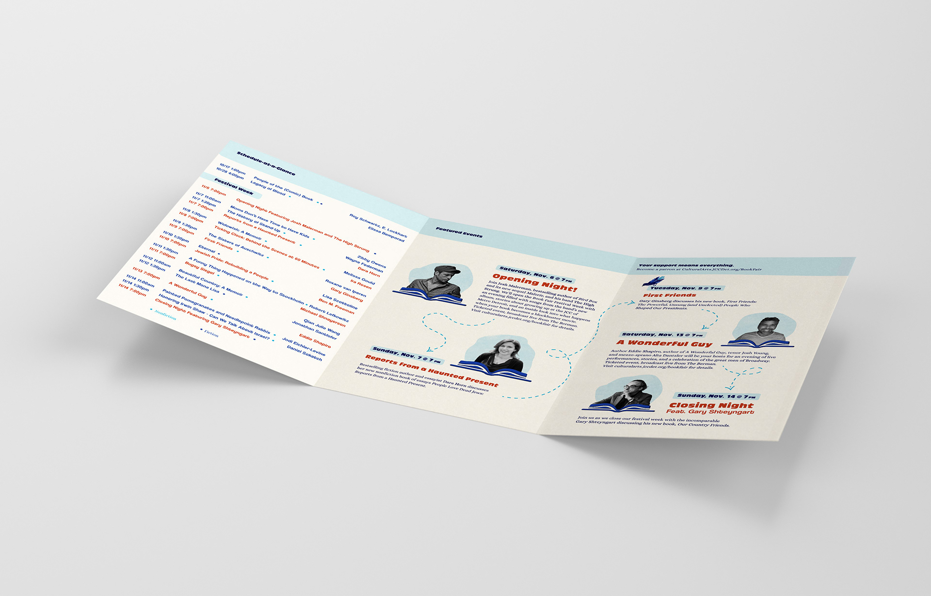
2021 brochure mailed to over 6,800 households throughout metro Detroit.

